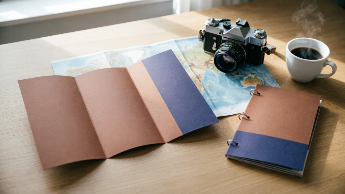
Featured Snippet: A travel brochure example typically falls into one of five formats: tri fold, bi fold, digital PDF, poster style, or booklet. S
trong examples share four traits: a bold cover photo, a clear itinerary or highlights list, pricing or contact details, and a single call to action guiding the reader toward booking.
Planning a trip, building a marketing packet, or finishing a school project can stall out fast when there’s no real example to work from. A blank page rarely inspires confidence, and generic templates often miss the details that make a travel brochure genuinely useful.
This guide breaks down real world examples of a travel brochure from national park handouts to tour operator mailers and shows exactly what separates a forgettable flyer from one that gets read cover to cover.
If the goal is designing a brochure for a client, a classroom assignment, or a small travel business, the examples and structure below can be copied, adapted, and put to work right away.
What Is a Travel Brochure?
A travel brochure is a short, visually driven document that promotes a destination, tour, or travel service using photos, brief text blocks, and practical details like pricing, dates, or contact information. It’s built to be scanned in under a minute, not read like an article.
Most brochures exist to answer one traveler’s question fast: why should I go here, and how do I book it? That’s why layout and hierarchy matter as much as the writing itself.
Brochures show up in a few common settings across the travel industry:
- Visitor centers and state welcome stations
- Travel agency counters and trade shows
- Hotel lobbies and airport kiosks
- Digital downloads on tourism board websites
- Email attachments from tour operators
Types of Travel Brochures (With Examples)
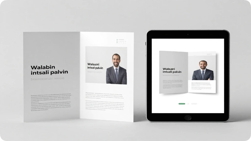
Different brochure formats suit different goals, and picking the right one shapes everything from word count to fold placement.
Tri Fold Brochure
The most common format, a tri fold divides one sheet into six panels: a cover, a back panel, and four interior panels. Example: many state tourism boards, like Visit Florida or Visit California, use tri folds to cover a region’s top attractions, a small map, and seasonal event dates in one compact handout.
Bi Fold Brochure
A bi fold offers four larger panels, giving more room for photography. Example: boutique tour operators often use this format for a single guided trip, pairing a full bleed cover image with a day by day itinerary inside.
Digital or PDF Brochure
Built for email and web downloads, digital brochures skip print constraints and can include clickable links, embedded booking buttons, or QR codes. Example: cruise lines frequently send PDF brochures with itinerary maps and cabin pricing tables.
Poster Style Brochure
A single large panel meant for visual impact over detail. Example: national park visitor centers post large format brochures highlighting one seasonal trail or event.
Booklet Brochure
Multiple stapled or folded pages, used when a destination needs more depth. Example: city tourism bureaus like NYC & Company or Visit Seattle publish multi page booklets covering neighborhoods, transit, and dining by district.
Key Elements Every Strong Travel Brochure Example Includes
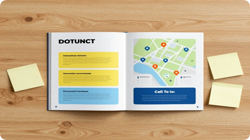
The best travel brochures share a consistent structure, regardless of format or destination. Missing even one of these elements tends to weaken the whole piece.
| Element | Purpose | Where It Appears |
| Cover photo + headline | Grabs attention in under 3 seconds | Front panel |
| Destination highlights | Answers “what’s here?” quickly | Interior panels |
| Map or location reference | Orients the traveler | Interior or back panel |
| Practical details | Hours, pricing, seasons, contact info | Interior or back panel |
| Call to action | Tells the reader what to do next | Back panel |
| Branding | Builds trust and recognition | Cover + back panel |
A brochure missing the call to action is the single most common flaw even a well designed layout underperforms if it never tells the reader If to call, click, or visit.
Real Examples of a Travel Brochure by Purpose
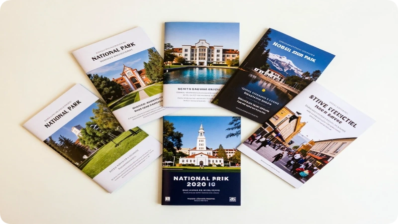
Different goals call for different brochure content. Below are five practical examples grouped by what the brochure is trying to accomplish.
1. Destination Overview Brochure
Best for: state and city tourism boards Example content: A Colorado tourism brochure might open with a mountain skyline photo, list five top attractions (Rocky Mountain National Park, Garden of the Gods, Pikes Peak, Mesa Verde, Great Sand Dunes), and close with a QR code linking to a full trip planning site.
2. Guided Tour Brochure
Best for: tour operators and travel agencies Example content: A Grand Canyon rafting tour brochure typically features a day by day breakdown, gear included, group size, and a pricing table with early booking discounts.
3. National Park or Trail Brochure
Best for: federal and state park visitor centers Example content: National Park Service brochures follow a distinctive design standard known as the Unigrid system, created in the 1970s, which gives every park brochure a matching layout with a trail map on one side and history and safety information on the other.
4. Hotel or Resort Brochure
Best for: individual properties Example content: Room categories, amenities, nearby attractions, and a seasonal rate chart, often paired with a lifestyle photo of the pool or lobby.
5. Event or Festival Brochure
Best for: seasonal tourism campaigns Example content: A New Orleans Mardi Gras brochure might combine a parade schedule, safety tips, and a map of viewing areas with a bold, festive cover design.
Sample Travel Brochure Layout (Step by Step)

Building a brochure from scratch is easier with a repeatable structure to follow. This six step layout works for print or digital formats.
- Choose the format tri fold for overviews, bi fold for single trips, booklet for multi topic destinations.
- Pick one strong cover image; a wide, well lit photo performs better than a photo collage.
- Write a headline under 8 words direct and benefit focused, not clever.
- Draft three to five content panels one idea per panel, 40–60 words each.
- Adding a map, table, or icon set visuals should carry as much weight as text.
- Close with contact info and a call to action phone number, website, or QR code.
Travel Brochure Design Tips (Do’s and Don’ts)
Good design choices make the difference between a brochure that gets picked up and one that gets skipped.
Do:
- Use one consistent font pairing (one for headlines, one for body text)
- Keep text blocks short brochures are scanned, not read start to finish
- Leave white space around photos and headlines
- Match brand colors across cover and interior panels
Don’t:
- Crowd more than three photos onto a single panel
- Use more than two typefaces
- Bury pricing or contact details on an inside fold
- Rely on stock photography that doesn’t match the actual destination
Common Mistakes to Avoid
Even well intentioned brochures fall short for a few repeat reasons:
- No clear call to action Fix: end every brochure with one specific next step, like “Scan to book” or “Call to reserve.”
- Too much text per panel Fix: cut copy to short, scannable phrases instead of full paragraphs.
- Outdated pricing or hours Fix: always add a line noting that rates and hours are subject to change, and direct readers to verify current details on the official site.
Digital vs. Print Travel Brochures
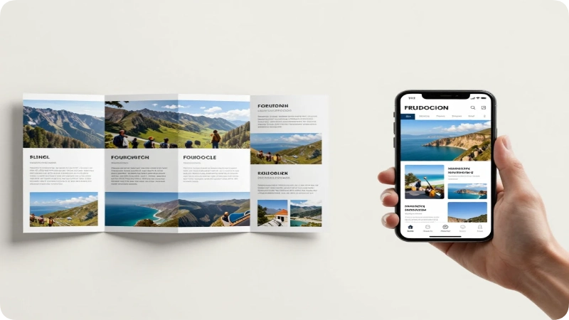
Print brochures still work well in visitor centers, hotel lobbies, and trade shows where travelers browse physical racks. Digital brochures, however, extend reach through email campaigns, social sharing, and embedded booking links making them a strong complement rather than a replacement.
Many tourism boards and agencies now design one core layout and adapt it for both formats, keeping branding consistent while adjusting for interactive elements like clickable maps or booking buttons in the digital version.
Where to Find Free Travel Brochure Templates
For anyone building a brochure from scratch, several accessible starting points work well:
- Canva drag and drop templates for tri fold, bi fold, and digital formats
- Microsoft Word/PowerPoint built in brochure templates under the “New Document” gallery
- Google Slides free community templates searchable by “travel brochure”
- State tourism board media kits some, like Visit California, offer downloadable brand assets for partners
FAQs
What is a good example of a travel brochure?
A strong example combines one striking cover photo, a short headline, three to five highlight sections, a simple map, and a clear call to action. National park brochures and state tourism tri folds are widely available real world examples to study.
What are the main types of travel brochures?
The main types are tri fold, bi fold, digital/PDF, poster style, and booklet formats. Each suits a different purpose, from quick destination overviews to detailed multi day tour itineraries.
How long should a travel brochure be?
Most print brochures fit six panels of a single folded sheet, with 40–60 words per panel. Digital brochures can run slightly longer since readers scroll rather than unfold.
What should a travel brochure include?
It should include a cover image and headline, destination or trip highlights, a map or location reference, pricing or contact details, and one clear call to action.
Can I make a travel brochure for free?
Yes. Tools like Canva, Google Slides, and Microsoft Word offer free templates that only require a photo, short text, and basic branding to complete.
What makes a travel brochure look unprofessional?
Overcrowded panels, mismatched fonts, low resolution photos, and missing contact information are the most common signs of an unpolished brochure.
Are digital travel brochures replacing print ones?
Not entirely. Print brochures still perform well in visitor centers and hotel lobbies, while digital versions extend reach through email and social sharing most tourism boards use both.
Final Takeaways
A great travel brochure example always does three things well: it grabs attention with one strong image, delivers trip details in short scannable blocks, and closes with a clear next step for the reader. Studying real examples from national park Uni grid brochures to state tourism tri folds makes it far easier to build one that actually works.
Start with a single format, borrow the structure that fits the goal, and keep the design simple enough to scan in under a minute. A well built brochure won’t just inform a traveler it will move them one step closer to booking the trip.
Note: Pricing, hours, and template availability mentioned above may change. Always verify current details directly with the relevant tourism board, park service, or template provider.

Maya Lin inspires travelers to explore the globe with absolute confidence and independence. Armed with a background in digital media and a decade of independent solo travel experience, she knows exactly how to navigate unfamiliar cities smoothly and safely. For Travelmarse, Maya curates the solo travel and hidden-gem verticals. She reviews charming boutique hotels, designs smart neighborhood walking routes, and shares practical language-learning hacks, giving readers the exact tools they need to travel solo without the stress.